1.20.2009


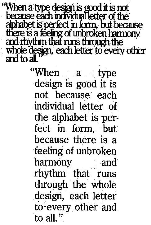
Good use of white space


Poor use of white space


Portrait orientation


Landscape orientation


Single column grid


Triple column grid


Mixed column grid


Heading flush with text


Marginal heading


Numbers used for a list


Bullet cue


Drop cap


Good ordering of information


Poor ordering of information


Citation style


Title and section head


Tabs/dividers


Header


Background/watermark


Frame using solid or dotted lines

1.12.2009


Effective choice of typography

Ineffective choice of typography

Serif typeface

Sans serif typeface

Script typeface

Novelty/iconic

12-14 pt size typeface for body of text

14+ size typeface used for headings/display

Italic type


Boldface type

All caps

Small caps

Outline or shadow typeface

Reverse type


Colored type

Kerning of capital letter

Appropriate and inappropriate line spacing

Full justification


Left justification with ragged right margin

Center justification

Right justification

Bad spacing/rivers

Trademark or symbol

Pull quote

1.06.2009

English 418 Journal #1


Text without visual component

Visual without text

Adapted to a specific audience, purpose and context

Balance

Classification or grouping into categories

Juxtaposition

Description or details

Narration

Repetition

Point of view

Proportion

Unity

Emphasis

Conciseness

Tone

Ethos

Logos

Pathos

Figure-ground contrast

Grouping by shape, spatial nearness, division